The new brand design for DOSB – the German Olympic Sports Confederation (Deutscher Olympischer Sportbund)
THE RING OF SPORTS

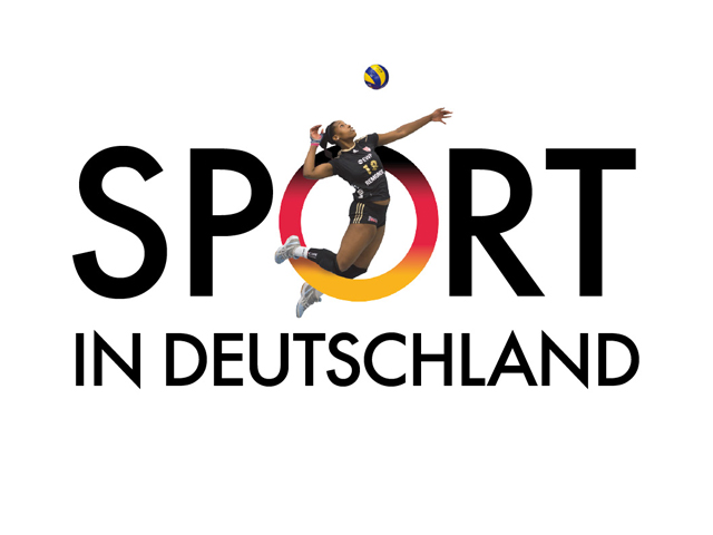
A big O, the Ring of Sports, will be the new symbol of the German Olympic Sport Confederation, or DOSB. Even though it is not a traditional logo, the O alone says it all—this is German athletics. The DOSB’s new brand design was conceived and produced by Realgestalt.
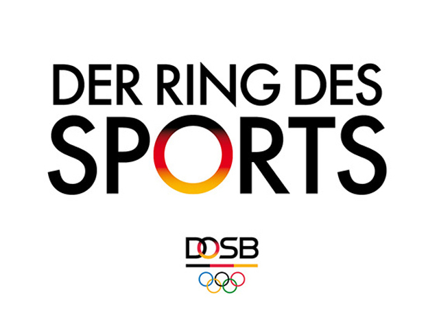
In the future, the DOSB brand will employ only its four letters. These letters—together with an underlying band in Germany’s national colors and the classic Olympic rings—create a unique trademark.
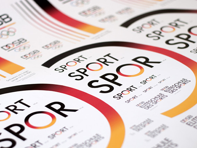
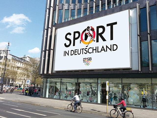
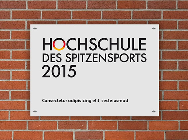
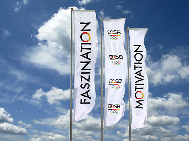
But even without the full trademark, it will be clear when an institution belongs to the DOSB—as this exemplary application illustrates.
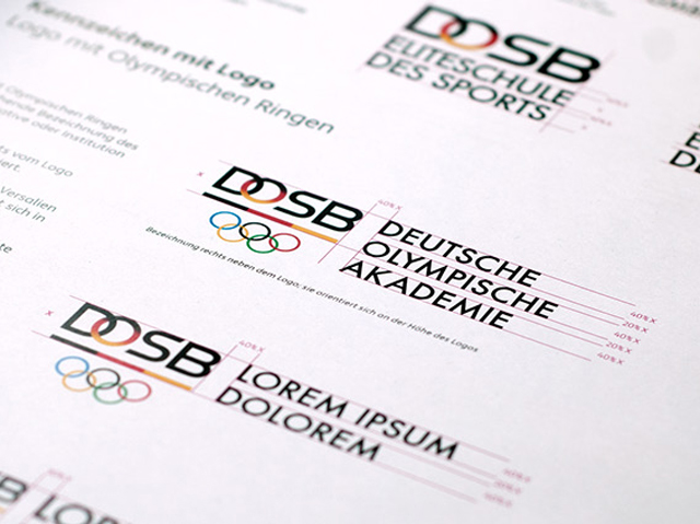
The Ring of Sports will be integrated into all of the DOSB’s official activities, projects, and organizations. This will create a strong sense of institutional coherence.
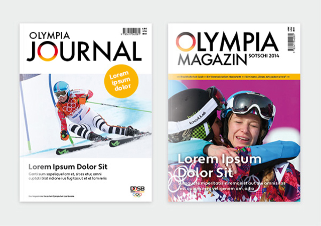
The Ring of Sports could also play a significant role in the editorial design of future DOSB publications—here are two exemplary cover designs.
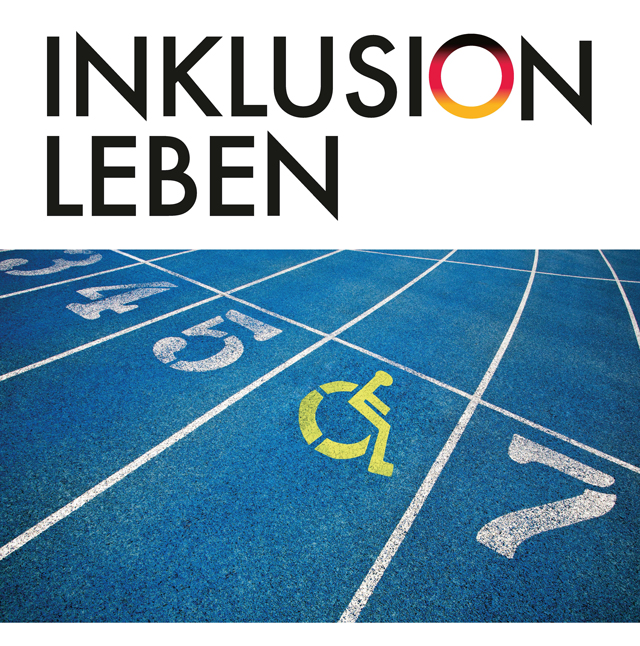
And, what luck that the next Olympic Games will be in Rio. The new DOSB brand design will integrate perfectly into the O of Rio.
„Now, the DOSB will finally be seen for what it truly is—the pinnacle of German sport,“ explains Hans-Peter Krämer, Vice President of the DOSB.